工地施工圍擋包裝有什么原則?
來源:http://www.retraactit.com/ 發(fā)布時間:2022-04-20
工地施工圍擋現(xiàn)如今并不僅僅是為了實用了,包裝設計的好也是吸引客戶來購買的一大原因,所以圍擋包裝的原則需要了解起來,下面就跟著小編來看看吧。
Site construction enclosure is now not only for practical, good packaging design is also a big reason to attract customers to buy, so the principle of enclosure packaging needs to understand, follow the small series to see.
整體布局不能很平
The overall layout should not be very flat
如果按照戶外廣告牌制作的一般思路設置墻體廣告,外觀會平淡無奇,布局也不會達到驚艷的效果。因此,墻體廣告與其他戶外廣告相比,要在版面上下功夫,不僅要讓每一個廣告牌都精彩紛呈,更要注重整體效果,力求整體的審美效果。
If the wall advertising is set according to the general idea of outdoor billboard production, the appearance will be plain, and the layout will not achieve the amazing effect. Therefore, compared with other outdoor advertising, wall advertising should first work hard in the layout, not only to make every billboard wonderful, but also to pay attention to the overall effect, and strive for the overall aesthetic effect.
房地產(chǎn)圍擋廣告大多由一組內(nèi)容連貫的廣告牌或多條相對獨立的內(nèi)容組成。因此,要注重整體效果,力求整體美觀。如果只追求每塊廣告牌的個體效果而忽略整體美感,即使每塊廣告牌都是精品,這組廣告也很難給人留下深刻印象。
Real estate wai block advertising mostly by a group of coherent billboards or a number of relatively independent content. Accordingly, want to notice integral result, do one's best integral is beautiful. If you only pursue the individual effect of each billboard and ignore the overall beauty, even if each billboard is high-quality, this group of advertisements will be difficult to leave a deep impression.

顏色不能沉悶
Color should not be dull
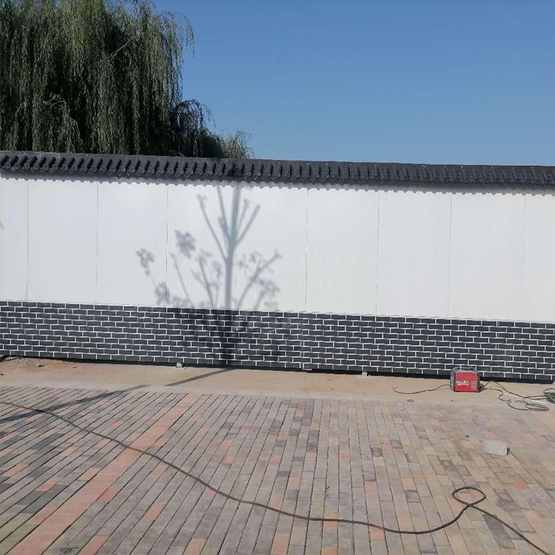
一般來說,工地施工圍擋廣告的基調(diào)應該在3種左右。如果色調(diào)過于單一,就會顯得過于沉悶和煩人。太多了,就會太花哨,眼花繚亂,讓人迷惑。此外,該項目施工現(xiàn)場多為塵土飛揚。如果外殼顏色太深,再蒙上一層灰塵,就更灰了。此外,行人往往匆匆而過,沒有鮮艷的色彩,就無法引起行人的注意。更重要的是,合理的配色可以從遠處吸引行人的注意力,達到廣告的目的。
Generally speaking, the keynote of the site construction enclosure advertisement should be in 3 kinds or so. If the tone is too single, it will appear too dull and annoying. Too much, and it's too fancy, too dazzling, too confusing. In addition, much of the construction site is dusty. If the shell is too dark, a layer of dust will make it even more gray. In addition, pedestrians tend to hurry by, without bright colors, it can not attract the attention of pedestrians. What's more, a reasonable color scheme can attract the attention of pedestrians from a distance and achieve the purpose of advertising.
文本不應該很空
The text should not be empty
評判文案沒有固定的標準,但好的文案要讓觀眾明白你在說什么。文案還要力求簡潔、醒目,有速度感,即短而流暢。因為工地圍擋的主要觀眾是路人,所以大部分人也可能會開車經(jīng)過。如果文案太長,除非非常精彩,否則很少有人停下來仔細閱讀。再者,圍擋廣告一般靠近工地,揚塵飛揚,行人不愿靠近。如果文案不夠醒目,字體不夠大,效果就不好。
There are no set criteria for judging copywriting, but good copywriting must first make the audience understand what you are saying. Copy should also strive to be concise, eye-catching, with a sense of speed, that is, short and smooth. Because the main audience of the site enclosure is passers-by, so most people may also drive by. If it's too long, few people will stop to read it carefully unless it's brilliant. In addition, wai block advertising generally close to the site, dust flying, pedestrians do not want to close. If the copy is not bold enough and the font is not large enough, the effect will not be good.
工地施工圍擋包裝有什么原則?以上講解了三個方面的原則,另外還有一個原則也要知道,工地施工圍擋包裝時要有明晰的結構,層次分明,讓人一看就懂。更多內(nèi)容就來我們網(wǎng)站www.retraactit.com看看吧!
What are the principles of site construction enclosure packaging? The above explained the three aspects of the principle, there is also a principle to know, the site construction enclosure packaging to have a clear structure, clear hierarchy, let a person understand. Come to our website www.retraactit.com for more content!
- 上一篇:PVC圍擋的不同應用是怎樣的?
- 下一篇:圍擋安裝出錯之后怎么進行補救?



 魯公網(wǎng)安備
37018102000522號